Project Goal:
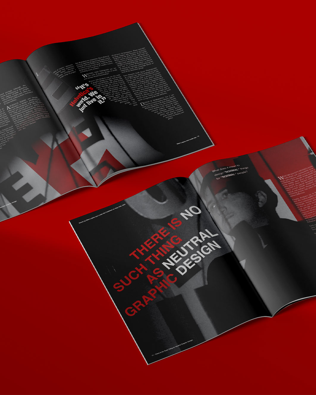
Create a conceptual editorial spread centered on the provocative headline “There Is No Such Thing As Graphic Design.” The goal was to visually explore the idea of design as an ever evolving cultural mirror, while interrogating the over-glorification of design “rules” and sacred cows like Helvetica.
Process:
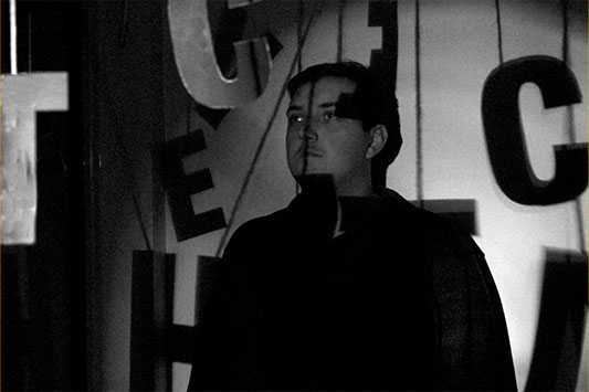
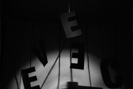
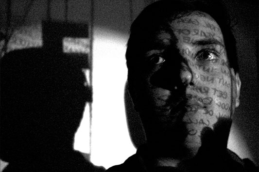
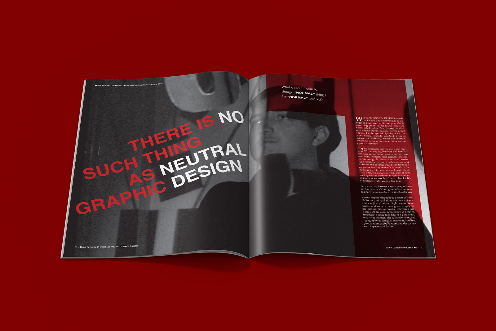
The layout treats Helvetica not just as a typeface, but as a character, an icon perched high on a metaphorical pedestal. Through original photography and precise art direction, I staged Helvetica as a revered artifact, using moody lighting, dramatic backdrops, and elevated physical placement to convey a sense of mythos and institutional reverence. The visual metaphor plays with irony, reflecting on how certain design standards are both worshipped and worn thin by overuse. The photography was styled to feel like a museum exhibit meets product ad hyper-polished, a little self-serious, and intentionally sterile. This aesthetic clash heightens the conceptual tension: we’re honoring Helvetica while simultaneously questioning why we do. The layout leverages a strict grid system as a nod to Modernist principles, then disrupts it with broken alignments and unconventional type treatments to underscore the article’s thesis.The title is fractured across the spread, breaking rules to make its own point.
Reflections:
This piece was an exercise in critical design thinking challenging me to use visual language not just to inform, but to provoke. By leaning into conceptual contrast and formal tension, the spread becomes a self-aware commentary on the discipline itself. It’s both homage and critique, holding a mirror up to design culture and asking: who decided what “good design” is anyway?